You know the look: colors perfectly smooth, edges perfectly clean, and a painting that feels like it was generated rather than made. Traditional media has soul because it is imperfect, paper fights the pencil, pigment pools at edges, smudges stay smudged. The secret is not magic plugins; it is deliberately reintroducing that honest friction into your Procreate workflow.
Why default digital brushes look sterile
Default digital brushes are engineered for smoothness: perfectly round, perfectly blended, perfectly repeatable. Real media is none of those things. Charcoal crumbles. Pencil skips across paper tooth. Watercolor blooms where water collects. The fix starts with swapping sterile tools for brushes that carry the behavior of the physical medium.
1. Start on real paper, digitally
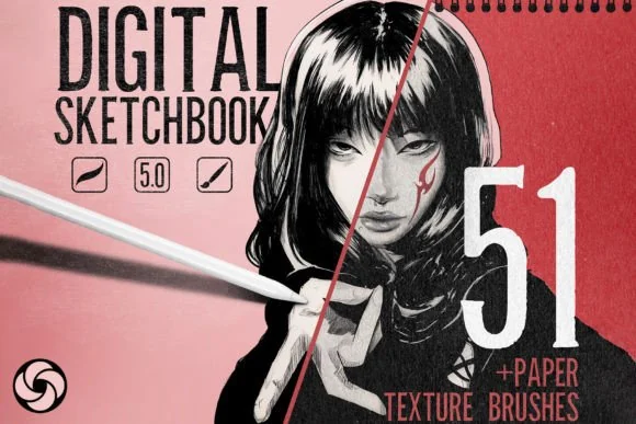
Nothing flattens digital art faster than the pure white default canvas. Begin every piece with a seamless paper texture on a top layer set to Multiply or Overlay at 10–30% opacity, or paint directly onto a textured background layer. The Professional Digital Sketchbook bundles sketching brushes with seamless paper textures and torn-paper stamps for exactly this.
2. Use brushes with real media behavior
Match the tool to the medium you are imitating:
- Charcoal: the Charcoal Studio reproduces carbon grit, deep blacks and crumbly smudge, not the soft grey "fake charcoal" look
- Pastel: the Dreamy Pastel Art Kit gives you grainy stick texture and velvet-soft blending
- Watercolor: the Watercolor Studio Kit simulates pigment bleed, wet edges and paper granulation
- All-round traditional: the Pro-Sketch Traditional Art Kit covers wax crayon, oil pastel and graphite in one kit
3. Leave your mistakes visible
Traditional artists cannot Ctrl+Z, and that constraint creates energy. Keep construction lines ghosted under the final work at low opacity. Let strokes overlap at the edges. Resist the urge to smooth-artboard everything.
4. Break your edges
Vary hard and soft edges exactly the way physical tools do: a loaded brush makes a hard edge where it lands and a dry, broken edge where it lifts. Use textured brushes whose edges break naturally instead of cutting selections around shapes.
5. Limit and weather your palette
Real pigment sets are finite, that limitation creates harmony. Work from a small, curated palette (the free DigiKitPro Color Vault ships 40 ready palettes) and mix digitally as you would physically: pull color across the canvas, let adjacent hues contaminate each other slightly.
6. Smudge like you mean it
A textured smudge pass, dragging pigment into pigment, is the fastest way to kill the digital look. Smudge with the same brush family you painted with: charcoal smudge for charcoal, pastel smudge for pastel.
7. Finish with a unifying texture pass
Traditional pieces are unified by the surface they live on. A final paper canvas or grain layer over the top (Overlay or Soft Light, low opacity) marries every stroke into one believable surface.
FAQ
Do I need huge canvases for a traditional feel?
Resolution helps texture read clearly, 3000×3000 px or larger at 300 DPI keeps grain crisp without forcing you to overscale brushes.
Which blend modes work best for paper textures?
Overlay for balanced mid-tone grain, Multiply to embed a texture into shadows, Soft Light for the gentlest unifying grain.
Can this workflow work for character art, not just fine art?
Absolutely. The same texture, edge and palette discipline is what gives modern stylized character art its warmth, the softness of anime watercolor comes from exactly the same principles.