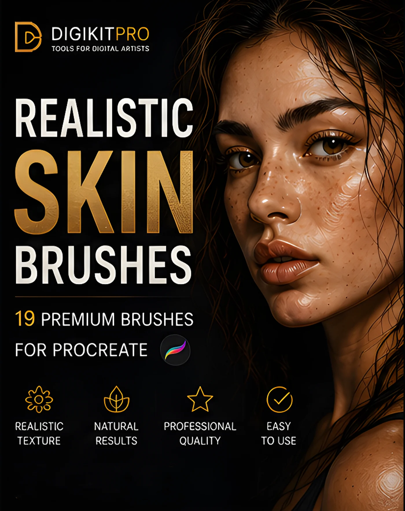
Smooth color is what makes digital skin look like plastic. The fix is texture, but not one big stamp across the face. Believable skin texture is built in deliberate layers, placed only where they belong and scaled to match your canvas. This guide is the texture-specific companion to our full realistic skin workflow.
Rule 1: Texture lives in the light
Human eyes read texture where light rakes across a surface, the top of the cheekbones, the forehead plane, the nose bridge, the chin. Shadows swallow texture. So paint texture passes almost exclusively on lit planes, and let shadowed skin stay soft. Texture everywhere is noise; texture in the light is skin.
Rule 2: Match pore scale to canvas size
On a 3000 px portrait, a visible cheek pore is 2–4 px wide. If your texture brush prints pores the size of polka dots, the problem is scale, not the brush: drop the brush size or work on a larger canvas. Portrait texture brushes like the 19 in the Portrait Skin Brushes set are tuned for close-up portrait scale.
Rule 3: Stack at least three texture intensities
Professional skin texture is a chord of layers, each on its own layer at low opacity:
- Micro-grain (5–10% opacity, everywhere in the light), kills perfect smoothness
- Pore texture (10–25%), cheekbones, forehead, nose; the visible skin surface
- Specifics, freckles, moles, beauty marks, faint wrinkles, the odd blemish
Keeping each intensity separate means you can dial the realism in afterwards instead of repainting.
Rule 4: Freckles obey the sun
Freckles cluster where UV exposure peaks: the bridge of the nose and the tops of the cheekbones, thinning outward. Laws of believable freckles:
- Asymmetric placement, mirrored freckles read as a filter
- Varied size and opacity, some fresh and dark, others faint
- Cooler browns for subtle freckles, warmer reds for sun-kissed ones
- A dedicated freckles brush (included in the skin set) so each dot differs naturally
Rule 5: Wrinkles are carved, not drawn
A convincing wrinkle is two strokes, not one: a soft dark line for the crease and a thin warm highlight on its raised outer edge, which is what makes it sit *in* the skin. Smile lines, crow's feet and forehead creases all follow this carve-and-light logic. The wrinkles and crinkles brushes in the skin set build both parts of the fold.
Rule 6: Blend with tooth, not glass
After texture, soften transitions with a textured blender, never a smooth airbrush. Textured blenders merge passes while preserving the grain that makes the surface human. Over-smooth blending is the exact plastic look this whole guide exists to prevent.
FAQ
At what opacity should I paint skin texture?
Start lower than feels useful: 5–15% for grain, 15–30% for pores. Texture builds up across passes; anything heavy in one stroke looks like noise.
Can I use these techniques for stylized characters?
Yes, reduce intensity, keep placement rules. Stylized skin still benefits from micro-grain in the light; just skip pores and push freckles and blush for charm.
Do texture brushes work on dark skin tones?
Absolutely, and they matter even more: deep skin shows beautiful warm specular texture on lit planes. Keep the same light-plane placement and lean into warm, saturated highlights.