Blending is where digital paintings go to die. Not because artists blend "wrong", but because they blend with the wrong tool: a perfectly smooth airbrush that erases every trace of texture and turns living color into shinier plastic. This guide explains what a good blending brush actually does, and the techniques behind professional transitions.
What blending should do (and what it usually does)
A transition between two colors should feel like paint moving into paint, visible tooth, micro-variation, pigment logic. The default-blend approach averages pixels into featureless gradients, which is readable to the eye as machine output. That is the entire "uncanny smoothness of digital art" problem in one sentence.
The three blending tool types (and when to use each)
1. Textured blending brushes
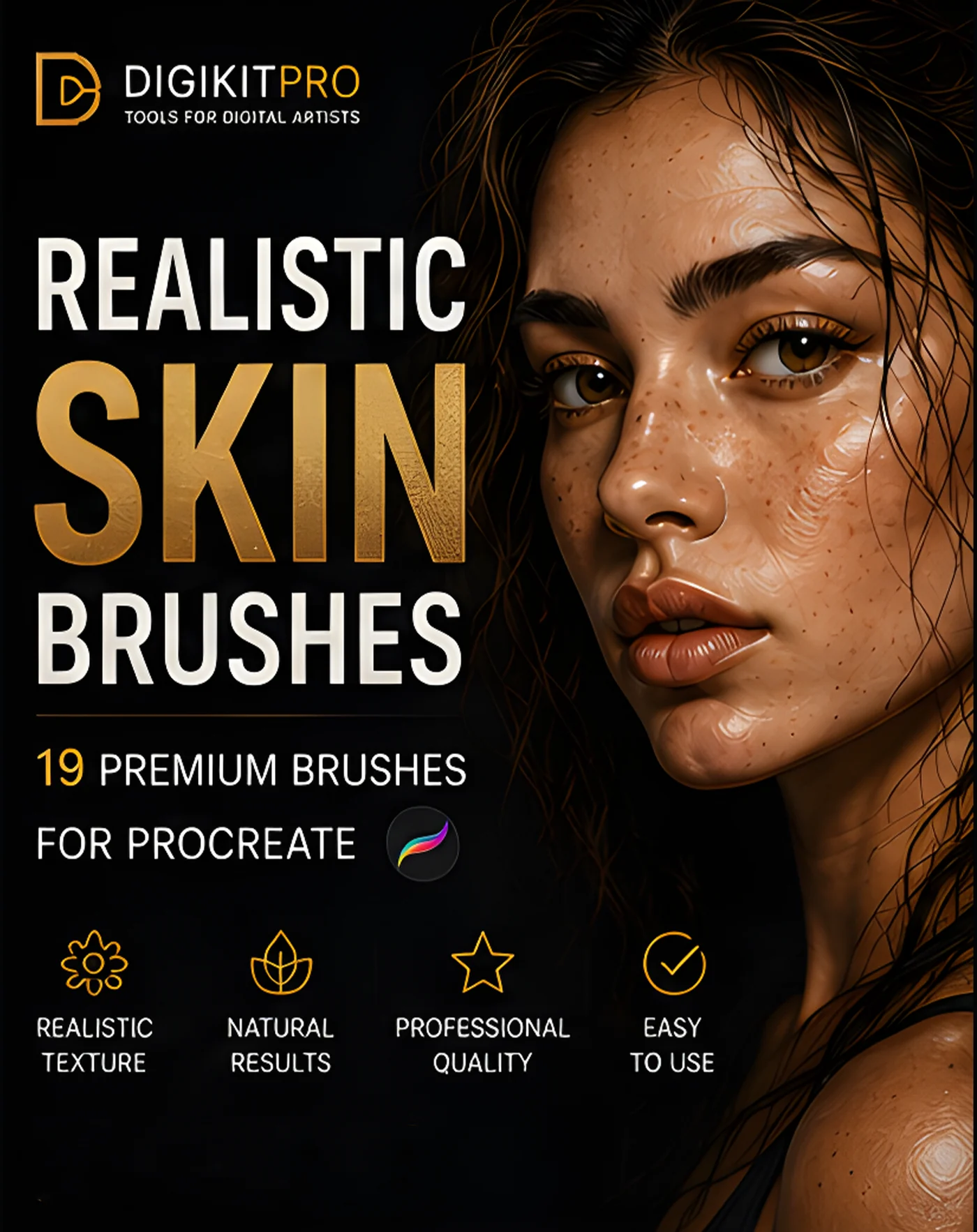
Brushes whose tips carry paper grain or pigment noise. You paint the transition directly, and the blend lands already textured. Best for skin (the Portrait Skin Brushes set includes textured blenders designed specifically to dodge plastic skin) and anywhere you want a painterly finish with full control.
2. The smudge tool with a textured brush
Tap-and-hold the paintbrush icon to copy its tip into the Smudge tool, a pro habit. Smudging with a soft airbrush smears detail; smudging with a charcoal or pastel-textured brush drags pigment into pigment with visible grain. Best for pushing existing paint: softening a shadow edge, melting a blush zone.
3. Wet media blenders
Watercolor-style blenders move "water" more than pigment, producing blooms and backruns instead of averaging. Inside the Watercolor Studio Kit, the five dedicated fluidity blenders exist for exactly this, they soften while keeping the wash alive.
The technique: how pros actually blend
- Blend less than you think. Lay two colors down and make *two or three* directional passes across the border, then stop. Overworking is the failure mode, not under-blending.
- Follow the form. Blend strokes should trace the surface's direction (around the cheek sphere, along the jaw), against-form blending streaks instantly.
- Lower opacity, bigger brush. A 20% opacity pass at twice the size blends more naturally than small heavy circles.
- Re-grain afterwards. A whisper of paper texture over the blend zone (Soft Light, 10%) reintroduces the tooth the blend removed.
- Leave some edges. A painting with every edge soft has no focus. Decide your sharpest three edges and protect them religiously.
Matching the blender to the medium
- Oil/painterly: textured flat brush, low flow, broad form-following strokes, see the Blend section of the Portrait Mastery Kit
- Pastel: grainy velvet smudge, the Dreamy Pastel Art Kit smudge tools keep its signature powder
- Watercolor: wet blenders and clean-water softening of edges, never airbrush
- Charcoal/graphite: paper-tooth smudge, used sparingly over deep values
FAQ
Is the Smudge tool or a blending brush better?
Neither, they're partners. Blending brushes build; the smudge tool shepherds. Combine: paint rich, unblended color first, shepherd it with textured smudge, then reassert a few strokes on top.
Why do my blends look muddy?
Two suspects: blending *every* area the same way (uniformity = mud), and blending across too-different hues (green into red makes grey by definition). Blend neighbors, not opposites, and rebalance saturation afterwards.
Do I need separate kits per medium for good blending?
No, one textured blender plus a smudge setup serves most work. Medium-matched ones (watercolor, pastel) simply arrive pre-tuned, which saves the fiddling.